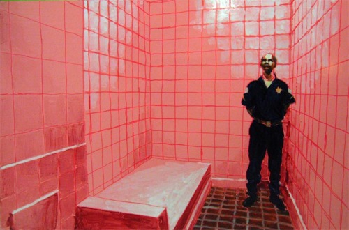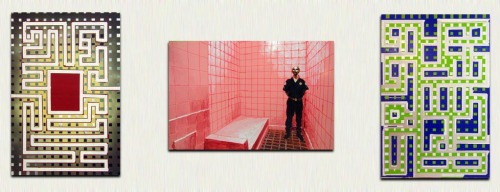
Another part done for the series. Same size as the labyrinths, made with enamel paint, permanent marker, oil + dammar.
Caption for the image (from the internet): “Cleveland Juvenile Justice and Delinquency Prevention Center is a prevention center, not a detention center”. A puzzling piece of information when connected to a picture of a detention cell.
According to some stydy, pink color is supposed to calm down aggression and violent behaviour. So just lock up the furious perpetrator and let the colour do it’s job… What a weird way of using hard (locking up) and “soft” (the psycho-physical effects of light/colour) force. In some other prisons in the U.S., for example Tent City, AZ, pink clothes have been used also for humiliating inmates.
About the psycho-physical effects, I wonder if the side-effects of pink include nausea and vomiting. I got kind of sick staring at too much pink while painting.
The link to my labyrinth motif is pretty much intuitive. Primarily I just fell for the absurd, hilarious, grotesque image of a pink cell, with a policeman in his dark blue uniform, as an accent both in visual and conceptual ways. I might be able to verbalise some points I had in mind, in spoken word, but translating my thoughts into short written form is quite tricky. But here’s something:
1. The physical distance between a cell and “freedom” is not very long. Finding the route requires a very special map (a good lawyer, connections, money, or the prison blueprints tattooed on you, works only on tv..) though.
2. To end up in a cell one has to make a wrong turn in the labyrinth of laws, rules and codes of conduct. The society-labyrinth is filled with traps, some quite harmless, some even lethal, at least for one’s social life.

3 out of 7 pieces on the wall.
Filed under: Uncategorized | 2 Comments
About the technique I used: the painting is a copy of a photograph fished from the internet, printed, traced on a transparency sheet by hand, overhead-projected on mdf, drawn and painted. I wanted to keep the image very close to its original documentational form (so not much altering/distortion of form), but still turn it into a painting, to relieve the image from being “just” a picture from the visible world. I don’t know if I’m making any sense.. Mostly I choose painting just because for me it’s the most natural and functional way of visualizing my ideas, and sometimes I even paint without having any ideas, just for the pleasure of (doing) painting, and for the overwhelming interest in all the aspects of painting (as an art form).
Multifunctional, that is the word coming to my mind, when I read your comment on your use of painting in relation to your feelings, intentions and motifs. I´ve said it before, but want to repeat my notion about the link between motivation and motif, the latter being a perhaps more noble term for theme. The terms are related to the Latin motus and explain something about ourselves. When we have a goal, then we have the drive to go towards that goal. Without a theme, no motivation. If we feel motivated without an explicit motive or theme (read idea), then it is there already and moves us, only unconsciously so. We have to do the work in order to become aware of the theme. This is often in my opinion a description of expression(ism). Kandinsky termed it “inner necessity”. From a certain point of view, “inner necessity” seems as good as explanation as “expressive” or “motivation”. Juho, you give a broad and obviously fair description about your diverse “motivations” for doing a painting. You have confidence in the medium, either as a test bed for experiments, started out in other media, like surfing the net and having the imagery printed from there, or then just as a medium with certain (number) of possibilities. Some of them you are familiar with to the extent that you can plunge into the process of painting “without” ideas. That is when I think you feel motivated by something you start searching for that will surface and get fixed later. Painting as an artform is malleable and intimate but gives the possibility for as much structure and constraints one care to take on. My example of the one end, the limitation of one´s own ideas and ways of working, is the Orthodox Icon. The other end is with paint “itself”. But this end of the scale comes with a large repertoire of solution you are familar with, both with regard to form and handling of the paint plus size, scale and the rest.
Sometimes I wonder, why we see so little of small sized paintings ( say Icon size). The small size goes mostly together with an amateur-look, kitchen sink ideology or, perhaps, gender-polarizing as well an association to minor art values of the hobby size paintings. Your paintings, Juho, could at this stage evade the small size fate if you consider yourself able to repeat your paintings, in a bigger size. Can you set aside, for a while, the criteria of spontaneity in your work and think about these paintings as experiments or sketches for a series of big size work? Now, I will not, ever, demand this of you. That is of course nonsense. But could you do a thinking experiment and tell me how you felt if pushed into doing the work once more in a bigger size. Why? Only because, compared to what we can see around us, in the world of painting, there seems to be a norm connected to “gallery” art, to paintings, that they should sustain in a spacious room, like in the Museum of Modern Art, EMMA, Espoo or Kiasma. Why am I asking all these unnecessary questions? Because, the other ones have already been answered by yourself.
When I try to think about your pink painting together with the labyrinths, I tend either to separate them from each other or start asking about other paintings still not there that could fill the gap between these different kinds of moving in and around the labyrinth. I get a strong feeling of decisiveness and gusto out of your paintings. The pink picture and the other ones making the triptych, on the whole, inspire each other. Especially, I feel the grid form implicit in all three paintings, interestingly working in different ways connecting the paintings. The pink painting shows a pictorial dominant, the cell ceramic tile grid, and this compares to the labyrinth idea of a grid as well. I think we need these kinds of formal hooks in different paintings to glue them together even if we use their contrasts also. Here a strong contrast comes from the different treatment of pictorial space or depth. The labyrinths are lacking a spatial convention of the room, instead there is a figure-ground division. A subdued reminder of depth arrives at the edge areas and the “cloud” like treatments when you use the “spray” or “iris” effects in the two paintings from the left. The pink room is something else and functions in the basis of a strong perspectival effect. I am, of course eager to see all the seven labyrinths, but as much starting to see a whole show from these first examples. I like your blunt and straightforward attitude in roaming around in the world of imagery and picking your ideas, exactly for that reason that you do so much with them as you do in turning the pictorial ideas into paintings. Here, the question of scale, is immediately present in the transformation.